Have you ever walked into a room and instantly felt calm, cheerful, or even energized without quite knowing why? More often than not, it’s the colors around you that create that effect. While wall paint, rugs, and furniture play their roles, one underrated hero of home décor is the cushion cover. The color of your cushion covers can dramatically influence the entire mood of a room—without requiring a complete makeover.
Let’s explore how different cushion cover colors impact your room’s ambience and how you can use them to set the perfect tone for your space.
The Psychology of Colors in Home Décor
Colors are powerful mood-setters. They don’t just add beauty; they also carry psychological associations that influence how we feel. A splash of yellow might lift your mood on a gloomy day, while a deep navy could make you feel grounded and calm.
Cushion covers, being small but noticeable, are an easy way to bring these psychological effects into your home. And the best part? You can change them according to seasons, moods, or special occasions.
Warm Colors for Energy and Vibrance
Warm tones like red, orange, and yellow are associated with liveliness, warmth, and energy.
-
Red Cushion Covers: Red is bold and passionate. Adding red cushion covers can instantly make a room feel vibrant and full of life. Perfect for social spaces like the living room, where you want conversations and energy to flow.
-
Orange Cushion Covers: Orange radiates creativity and warmth. If you want your room to feel welcoming and playful, this color works beautifully.
-
Yellow Cushion Covers: Cheerful and sunny, yellow cushions bring positivity into a space. A few yellow cushions on a neutral sofa can brighten the entire ambience.
Use warm colors when you want to bring in warmth, liveliness, and a cozy feel to your room.
Cool Colors for Calm and Relaxation
Cool tones such as blue, green, and purple create a sense of calm, balance, and serenity.
-
Blue Cushion Covers: Blue is universally calming. Whether it’s a soft pastel blue or a deep navy, this color has a natural ability to soothe the mind. Blue cushions are excellent for bedrooms and living rooms where relaxation is the goal.
-
Green Cushion Covers: Green symbolizes nature, growth, and harmony. Placing green cushions in your home can make the space feel refreshing and connected to the outdoors.
-
Purple Cushion Covers: Purple, especially in lighter shades like lavender, has a calming, almost luxurious feel. It adds sophistication while still promoting relaxation.
Cool colors are perfect for spaces where you want tranquility, like bedrooms, reading nooks, or meditation areas.
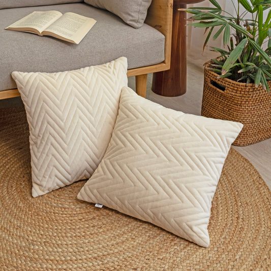
Neutral Colors for Timeless Elegance
Neutral shades—white, beige, gray, and brown—never go out of style. They bring balance and elegance to a space, making them extremely versatile.
-
White Cushion Covers: White is clean, fresh, and minimal. It instantly brightens a room and makes it feel more spacious.
-
Beige & Taupe Cushion Covers: These shades add warmth while keeping things understated. They pair beautifully with almost any décor style.
-
Gray Cushion Covers: Gray is modern, chic, and grounding. A sofa with gray cushions can look effortlessly sophisticated.
-
Brown Cushion Covers: Rich brown shades bring warmth and coziness, making a room feel more earthy and inviting.
Neutral colors are a safe choice if you prefer subtle elegance or if you love frequently experimenting with accent colors.
Bold vs. Soft Tones: Striking the Right Balance
It’s not just about choosing a color family—it’s also about the intensity of the shade. Bold, vibrant tones like bright red or turquoise bring energy, while muted or pastel versions of the same colors (soft pink, mint green, dusty blue) create a calmer vibe.
For example:
-
Bright yellow cushions can be fun in a lively living room, but pale lemon cushions might be more suitable for a serene bedroom.
-
Deep emerald cushions add drama, while soft sage green cushions bring peaceful freshness.
Think about the purpose of the room before deciding between bold or soft tones.
Mixing and Matching Cushion Cover Colors
The magic often lies in mixing colors. You don’t need to stick to just one shade—layering different hues can create depth and personality.
-
Monochrome Look: Stick to different shades of the same color, like navy, sky blue, and teal. This adds depth without feeling chaotic.
-
Contrasting Colors: Pair opposites like yellow and navy or pink and green for a bold, lively look.
-
Neutral Base + Pop of Color: Keep most cushions in neutral shades like beige or gray and add one or two bright-colored cushions for a striking accent.
Experimentation is key. You can keep switching covers until you find a combination that feels just right.
Seasonal Color Swaps for Fresh Vibes
One of the easiest ways to refresh your home without major redecorating is by swapping cushion covers seasonally.
-
Spring/Summer: Bright colors like yellow, orange, turquoise, and floral prints feel cheerful and breezy.
-
Autumn/Winter: Deep, rich colors like burgundy, forest green, mustard, and warm browns create a cozy, comforting vibe.
This small seasonal change can make your home feel more in tune with the time of year.
Final Thoughts
Cushion cover colors may seem like a minor detail, but they hold the power to transform the entire ambience of your room. Whether you want a cheerful, vibrant space or a serene, calming haven, the right shades can set the tone instantly.
So next time you’re thinking of refreshing your home décor, don’t overlook the impact of cushion covers. Play with colors, experiment with combinations, and watch your room’s mood change effortlessly.